Inspired by a great and creative solution by Matthew Devaney for creating number input masks for TextInputs, I wanted to see if I could turn this into a reusable component for easier consumption. Read on to see the solution.
Overview
I am continually amazed at the creativity coming from the low-code/no-code space these days, and a post by Matthew Devaney today gave me some inspiration to build on the solution and make a component out of it for easier consumption. In short, Matthew made a slick solution for applying a number formatting mask to a Text Input control as the user types in it.
First of all, you should go read Matthew’s post Power Apps Phone Number Formatting For Any Country (Input Mask) for the underlying concepts and technique for accomplishing the number mask feature. Once you’ve read that post, come back here to see how to turn it into a reusable component. Components make things much more consumable by app authors, and if you want a primer on Components you can read for following links:
- Create a component for canvas apps – Power Apps | Microsoft Docs
- PowerApps Reusable Components – Life on Planet Groove
Creating the Component
To make the input number mask more easily consumable, I am going to show how to make use of PowerApps Components. This will enable app authors to add input mask capabilities multiple times on a single screen or on other screens in an app with a lot less manual configuration, as the bulk of the logic formulas are encapsulated in the Component and don’t need to be constantly copy/pasted every time you need to use it.
My goal is to be able to easily insert a number mask component next to each TextInput that needs to be masked, and then set a few properties on the Component and TextInput to link them together and get the functionality. No cut/copy/paste of any complex formulas necessary.
To start with, I am going to create a new Component by clicking the Components tab in the left tree view area, and choosing + New Component.
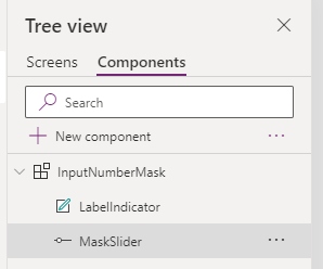
I’ll name the Component “InputNumberMask”. I’ll set the default Width to something relatively small like 135, and height to 35.
Next, I’ll Insert a Label and a Slider. I’ll set their X and Y positions both to 0, and their Width and Height properties to Parent.Width and Parent.Height.
Adding Custom Properties
Next, I’ll add some input and output properties to my control, which will be used to set the desired number mask and supply the input text to mask, and will return the output masked text and a max length number.
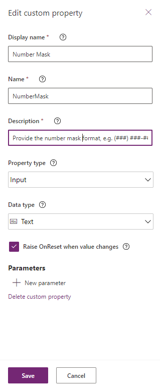
First I’ll add an input property of Type Text called “NumberMask”. This will be the desired mask format that a user will configure. A key option when setting this property up is to check the box to Raise OnReset when value changes (you’ll see why in a moment).
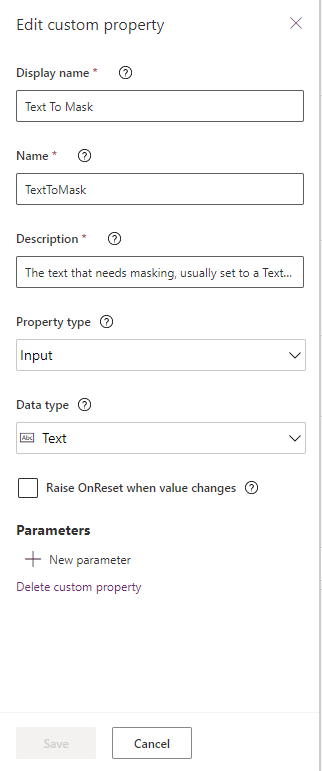
Next I’ll add an input property of Type Text called “TextToMask”. This will be the text that is typed into the TextInput that needs to have the mask applied to it.
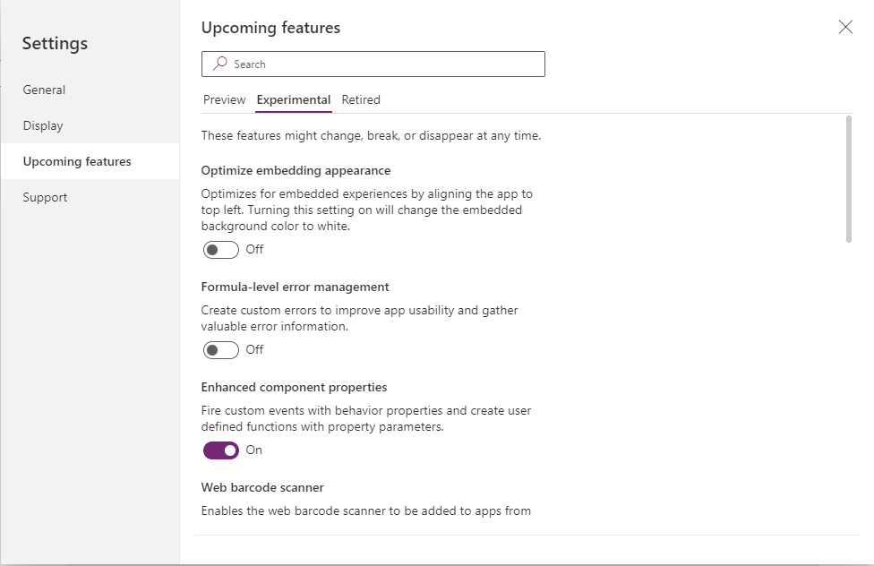
Next, I’ll add another property of type Behavior. These are new and still in Preview/Experimental phase, but they enable creating behavior/event properties like OnChange, OnSelect, etc. To enable this, I’ll have to go to the File menu, choose Settings, Upcoming Features, and under Experimental enable the Enhanced Component Properties feature.
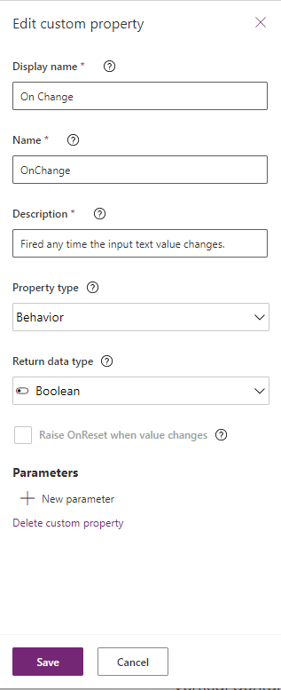
With components, in general you can’t reference controls directly between components and screens, you can only pass input/output variables I’ll need some way of calling Reset() to reset the value in my TextInput, and since I can’t pass in a Control as an input parameter, I’ll instead raise a custom event from within the component. I’ll add this last property as a Behavior type, call it OnChange, and set the Type to Boolean.
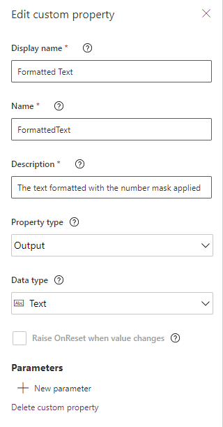
Finally I’ll add two output properties. The first one will be named “FormattedText”, be type Text, and will contain the final text value with mask applied.
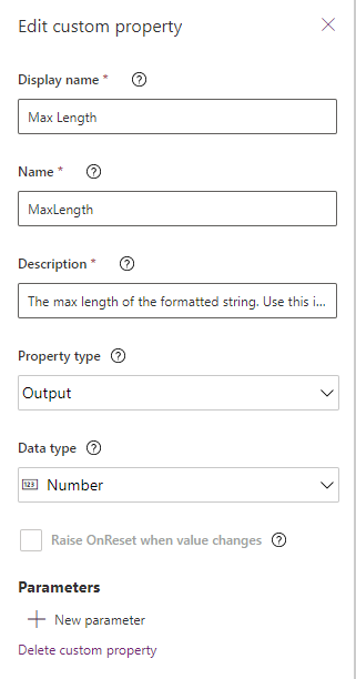
And the last property is a convenience one, “MaxLength”, type Number, which will just be the total Length of the FormattedText, so you can set the MaxLength of your TextInput equal to this.
Configuring the Slider and Component with Masking Formulas
Now that the properties are configured, I can port over Matthew’s formulas into the Slider control and Component properties. I’ll select the Slider control, and set the Default property of the Slider equal to Len(Parent.TextToMask).
In the OnChange of the Slider, I’ll use Matthew’s code as is, except I’ll change the MatchAll function to grab from Parent.TextToMask property instead of directly from the TextInput:
|
1 2 3 4 5 6 7 8 9 10 11 12 13 14 15 16 17 18 19 20 21 22 23 |
Set( varFormattedNumber, With( { varTextNumbersOnly: Concat( MatchAll( Parent.TextToMask, Match.Digit ), FullMatch ) }, Text( Value(varTextNumbersOnly), LookUp( colNumberFormat, CountNumbers = Len(varTextNumbersOnly), NumberFormat ) ) ) ); Parent.OnChange() |
Note with the code above, we are creating/updating a variable, varFormattedNumber, to store the output masked text every time the Slider changes (which is every keypress of the TextInput). Also note the added line at the bottom to raise the component’s custom OnChange event.
Next, I’ll select the Component itself. In the OnReset property, I’ll paste the other big block of Matthew’s that is responsible for creating the Collection of mask characters. Again, minimal changes are needed, and I’ll just grab the mask from the Component’s property directly (Self.NumberMask):
|
1 2 3 4 5 6 7 8 9 10 11 12 13 14 15 16 17 18 19 20 21 22 23 24 25 26 27 28 29 30 31 32 33 34 35 36 37 38 39 40 41 42 |
ClearCollect( colNumberFormat, With( {varTextNumberFormat: Self.NumberMask}, With( { varTableNumberFormat: ForAll( Sequence(Len(varTextNumberFormat)), With( { varNumberCurrentLength: Left( varTextNumberFormat, Value ) }, { NumberFormat: varNumberCurrentLength, CountNumbers: CountRows( MatchAll( varNumberCurrentLength, "#" ) ) } ) ) }, ForAll( Sequence( Max( varTableNumberFormat, CountNumbers ) ), LookUp( varTableNumberFormat, CountNumbers = Value ) ) ) ) ) |
Note that this OnReset event will be triggered every time a consumer of the component sets or changes the NumberMask property (which is why it was important earlier to Raise the OnReset event for this property). The component needs some event to fire in order to create the collection/table of mask characters, and the OnReset of the control is a perfect place to do that.
Next, I’ll change the MaxLength property on the component so that it defaults to Len(Self.NumberMask).

Then I’ll change the FormattedText output property to varFormattedNumber.

Finally, I’ll set the Slider Visible property to False, and set my Label’s Text property to Parent.NumberMask. This last part is just so that at design time a developer can see this component visually initially. After configuration, the consumer can set the Visible property of the Component itself to False so nothing actually shows in the UI.
Consuming the Component
To use the Component, I’ll go back to the Screen tab on the Treeview, and I’ll Insert a TextInput control on my canvas, and then also insert an instance of my InputNumberMask component right next to the TextInput.
To wire these two up together, I’ll select the Component and set the NumberMask property to whatever mask format I want, for example for US phone numbers it would be “(###) ###-####” or for US social security numbers “###-##-####”. Another cool idea is to set this mask string as the HintText property on your TextInput control, and then point the NumberMask property on the component to the HintText (TextInput1.HintText). This way your users will see a little placeholder in the TextInput with what the mask will look like.

For the TextToMask property, I’ll set it equal to the .Text property of my TextInput (in this case it is TextInput1.Text).

Lastly, I’ll set the OnChange property of the component to Reset(TextInput1).

Now I’ll set a couple properties on the TextInput itself. First, I’ll change its Default property to my Component’s output property, FormattedText (InputNumberMask_1.FormattedText).
And finally an optional property if you want to enforce MaxLength, is to set the MaxLength of the TextInput to the Component’s MaxLength output property (InputNumberMask_1.MaxLength).
I can play/preview the App and see it in action:

Conclusion and Download
By creating this as a Component, I’ve encapsulated all the logic in one place, and to consume it, I just need to add the Component to the screen and set 5 properties (3 on the component, and 2 on the TextInput). I can easily add multiple instances of this component on a screen (to support multiple TextInputs).
I’ve uploaded an exported zip of my sample app with the component in it standalone, and also as a component library in a Solution package. Feel free to use in your apps or build upon it.


Totally missing something – when I go to consume the object and assign FormattedText to the textbox, I’m being told that it is an unknown or unsupported function.